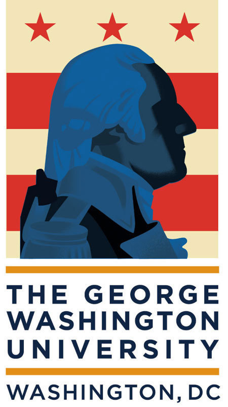
Last year, FutureBrand contacted me to contribute to their re-design of the logo for The George Washington University. My daughter did her undergrad at GW and she’s now in her last year of law school there, so I was already familiar with the university, it’s history and their existing logo.

The brief was to update, or modernize the logo for a bolder, cleaner, forward-looking design that could work well across all media, especially digital applications where the existing logo seemed soft and a little dusty. FutureBrand sent some photos of a famous bust of Washington by Jean-Antoine Houdon as the model for the new image.
On a project like this, I always feel like my role is a bit like a mind-reader, I'm never really sure where it’s headed, or how much of a departure from the existing logo the client is likely to accept. I decided to give them four approaches ranging from realistic to graphic and to deliver each approach in four possible color variations. I sent these off, they seemed to be well received, I got paid and never heard anything else about the project.
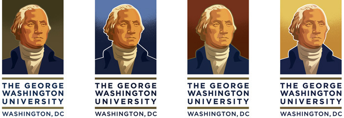
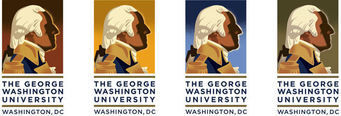
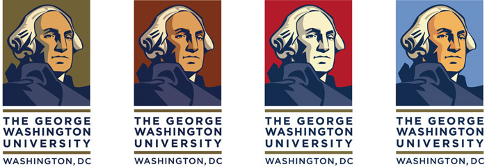
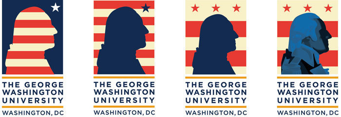
The new logo was unveiled this summer, it kind of makes you wonder why they bothered with a re-design at all.
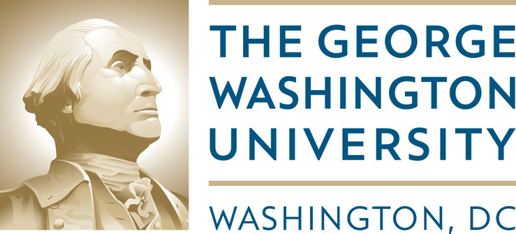
For me, the finished re-design is a disappointment, not just because they didn’t go with one of my directions, but it seems to not be a bolder, cleaner, forward-looking logo. (but, at least George is facing right.)
But it’s also not the gigantic logo disaster that the University of California just unveiled and quickly killed.
http://www.latimes.com/news/local/la-me-uc-logo-20121215,0,7912385.story