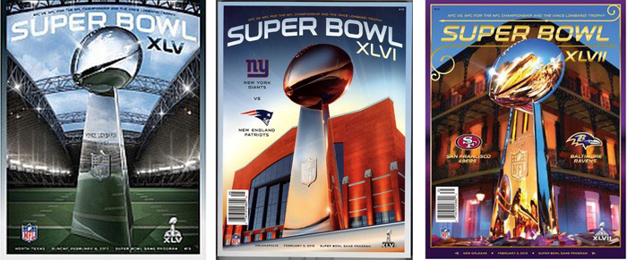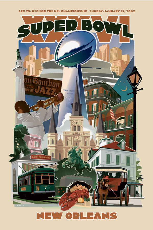
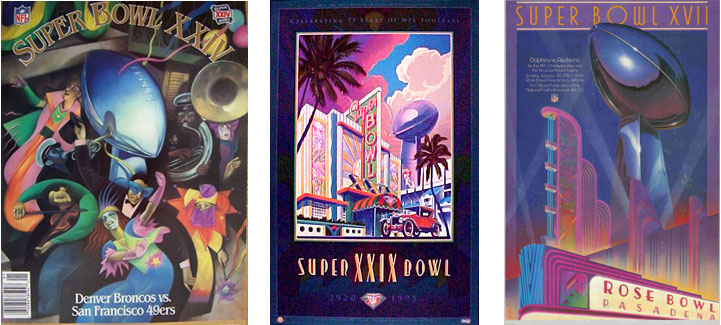
With the SuperBowl returning this weekend to New Orleans, it seems like a good time to bring a project out from the archives. In Spring of 2001, my friend Brad Jansen was art director at the NFL, he called to ask if I’d be interested in designing the official poster for the 2002 Super Bowl to be played in The Crescent City. It was an intimidating assignment. There’s a long history of illustrated Super Bowl posters dating back to the first game in 1967 and a lot of great illustrators had their shot at it. Even though the formula was the same every year – The Vince Lombardy Trophy surrounded by visual elements of the host city and no football players, there were some wonderful posters produced by illustrators that I’d always admired. The art gets used on program covers, tickets, and lots of souvenir items and becomes a part of NFL history.
New Orleans has no shortage of visual imagery and Brad and I decided on a collage of architecture that kind shows a view from the French Quarter in the foreground up to the Superdome at the top with, of course, the Lombardi Trophy in the center. We needed an image of a jazz musician and I included my friend, the long-time Saints fan, Wynton Marsalis. The poster was approved without any big revisions and I looked forward to seeing it printed on all its applications.
Then, 9-11. All bets were off for a few weeks and football didn’t seem too important.The NFL cancelled some games, adjusted the playoff schedule and decided to scrap the official logo and poster for a patriotic theme. Brad asked me to send him some ideas for a new poster, the new brief was Red-White-and-Blue, Football Players as Heroes, Eagles, Flags, and The Vince Lombardi Trophy.
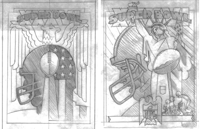
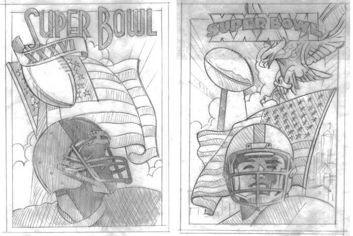
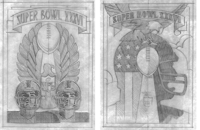
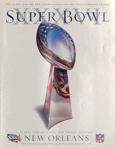
The sketches I sent all were rejected, and the new poster was a retouched photo, an image of the trophy with an American flag reflected in it.
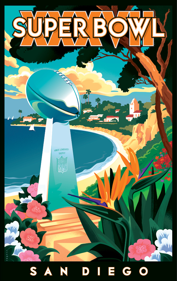
The next year the Super Bowl was played in San Diego and Brad, being the mensch that he is, knew I was disappointed with the outcome from XXVI and asked me to design the poster for XXVII. We came up with a vintage travel poster vibe showing the Southern California coastline.
There have been a lot of changes at the NFL since 2002 and it seems to me that they have just stopped trying to design memorable posters.
