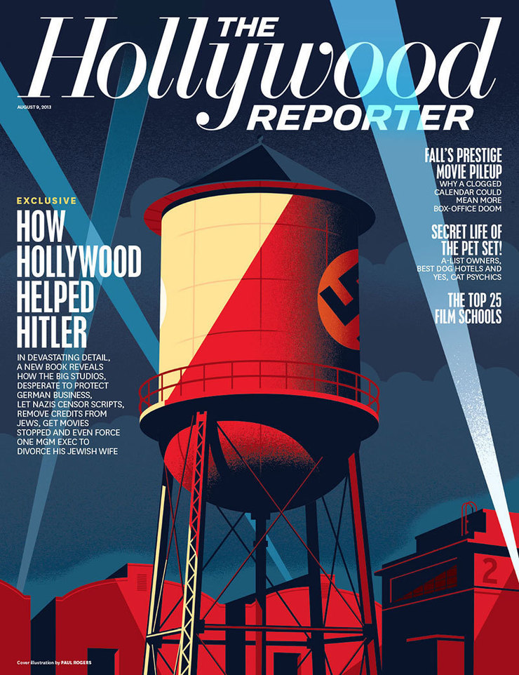
Last week I get an email from Shanti Marlar, Creative Director at The Hollywood Reporter that says they have a cover that she thinks I’d be perfect for, it’s about Hitler, would I be interested? That’s the kind of e-mail you read twice.
Turns out the cover story is a book excerpt from the forthcoming ‘The Collaboration, Hollywood’s Pact with Hitler’ by Ben Urwand. It’s a shocking story about how Hitler actually affected the movies in America. Before World War II the US studios were very concerned about losing the German export market for their films and worked closely with the Nazis to gain approval on finished films and scripts. Shanti had seen a piece I did for The New York Times that was in the style of the Stenberg Bros. Russian film posters and thought a combination of Hitler’s face and Hollywood imagery in that avant-garde style would make a good cover.

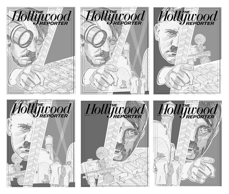
OK, so a cover illustration that features the worst human being in the history of the planet. I start by getting myself on a few NSA Hate-Group-Watch-Lists by Googling photos of Hitler and Nazi propaganda and begin working on sketches. I had my doubts about the Stenberg Bros. concept since they were busy in Russia in the late 1920s and we were talking Nazis and late 1930s, but the overall propaganda vibe seemed to work, and only Steven Heller would think I didn’t know my poster history. Shamelessly lifting one of Vladamir and Georgii’s most famous images that has a camera lens replacing the eye of a man, I worked up six designs and sent the sketches to Shanti, but I was thinking ‘This will never fly, Hitler’s not appearing on the cover of The Hollywood Reporter.

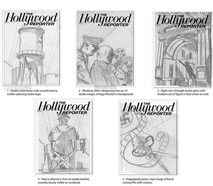
Cool heads prevailed at The Reporter offices. Maybe it was actually seeing sketches of Hitler right next to their famous masthead, or maybe it was the recent dust-up over the Boston Bomber’s appearance on the cover of Rolling Stone, or maybe it was something else all together, Shanti and her editor decided we should try some other approaches. So the next day, I send over five ideas that utilized a combination of Nazi propaganda and 1930s Hollywood imagery with a fairly wide range of emotional impact. Nazis are tricky, even when you’re dealing with a scholarly piece of history an illustrator has to be careful.

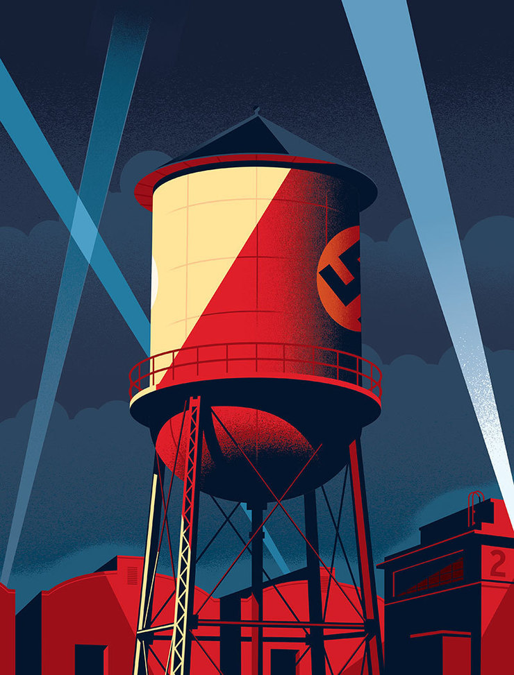
The backlot water tower with a swastika replacing a studio logo was chosen. This idea seemed to strike the delicate balancing act required for the cover, Nazi imagery hasn’t lost it’s power to shock or offend, but it’s a tough book about some tough decisions made by studio heads in the turbulent years just before the war. Anyway, it’s online now and soon to be cluttering up the newsstand outside Book Soup.