SORT BY
TOPICS ▼
Animation
Art Center Student Work
Baseball
Book Jackets
EDITORIAL
Forever Young
Jazz ABZ
Jazz at Lincoln Center
L.A. Sketchbook
London Sketchbook
Maps
Musicians
Name That Movie
New Orleans
On The Road: Illustrated Scroll
Paintings
Playboy Jazz Festival
Postage Stamps
Posters
Sketchbooks
The New York Times

House of the Future
New York Times Personal Health Column
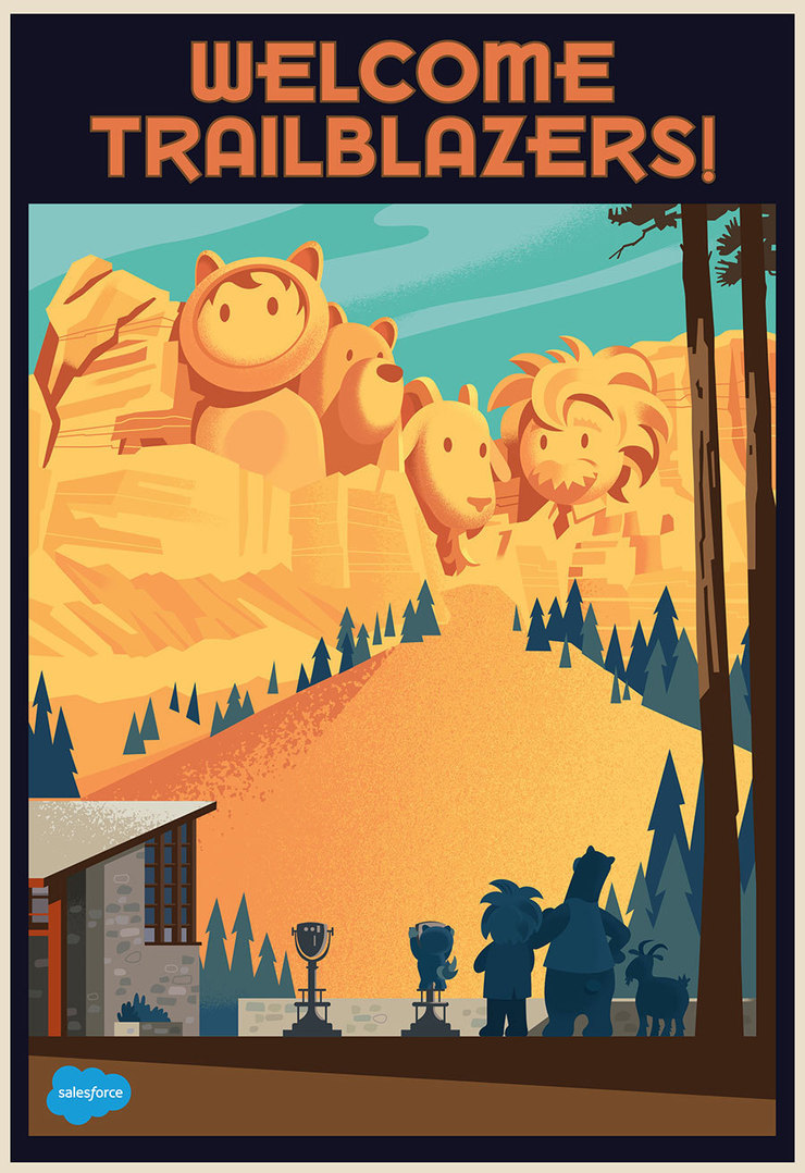
SALESFORCE

Odds and Ends from 2016
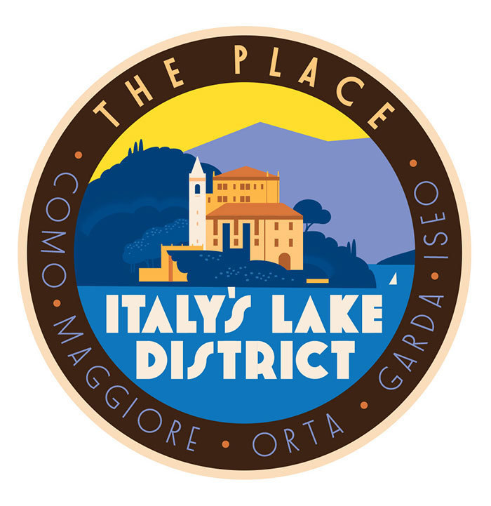
Travel and Leisure Magazine
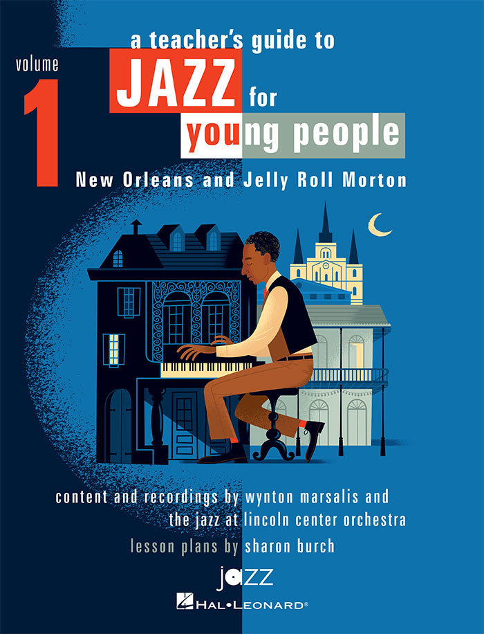
Jazz for Young People
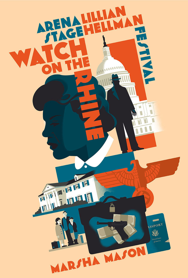
Watch on the Rhine Theater Poster
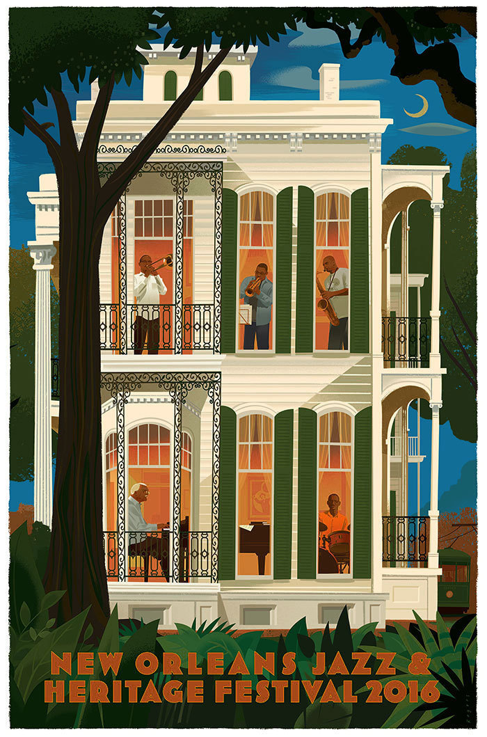
New Orleans Jazz & Heritage Festival
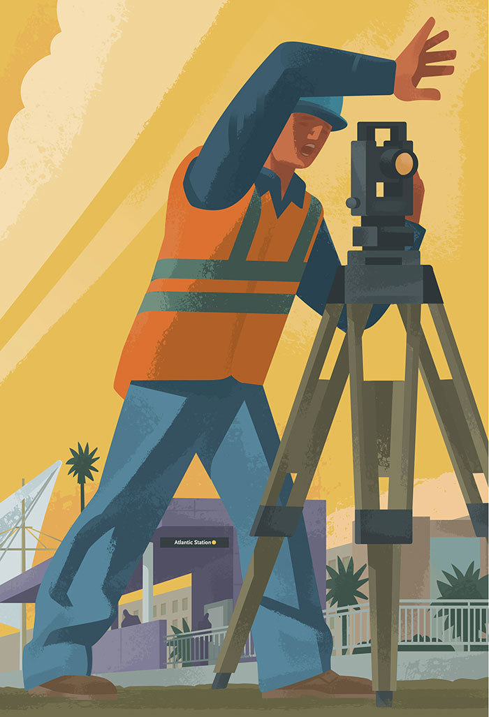
LA Metro