One day last year the friendly voice of Howard Paine was on the phone asking me if I’d like to design a jazz stamp for the US Postal Service. Louis Armstrong, Jelly Roll Morton, Duke Ellington, Charlie Parker, and about a dozen others have been honored with stamps in the past, and in 2008 Michael Bartalos designed a wonderful Latin Jazz stamp, but there has never been a single stamp to pay tribute to America’s original art form, jazz.
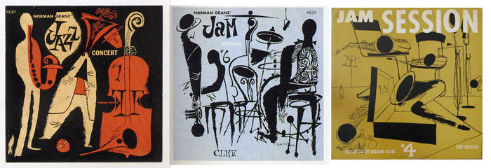
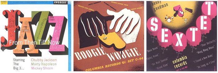
It’s always an honor to design a postage stamp, and because I love jazz and have great respect for the history of the music, this one was very special to me. I started by thinking of all the artists I admire from the past who have created visual art with connections to jazz. I was going to have to rise to the occasion and deliver a design that would sit well in my mind with those images, or I knew I’d feel bad about it for a long time.
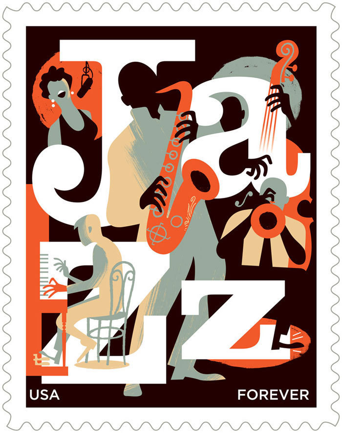
The only requirements Howard gave me was that the letters J-A-Z-Z appear in the design and that no recognizable performer be depicted. Beyond that, he left it in my hands as to how to communicate the feeling of jazz. I thought that the best way to proceed was to design three stamps and show them as completed designs. If I took three different approaches, I might improve my chances of getting the Stamp Advisory Committee to approve one, and by taking each design to a finished stage I could refine all the elements to a level that I’d be happy with and would eliminate any guesswork in the approval process.
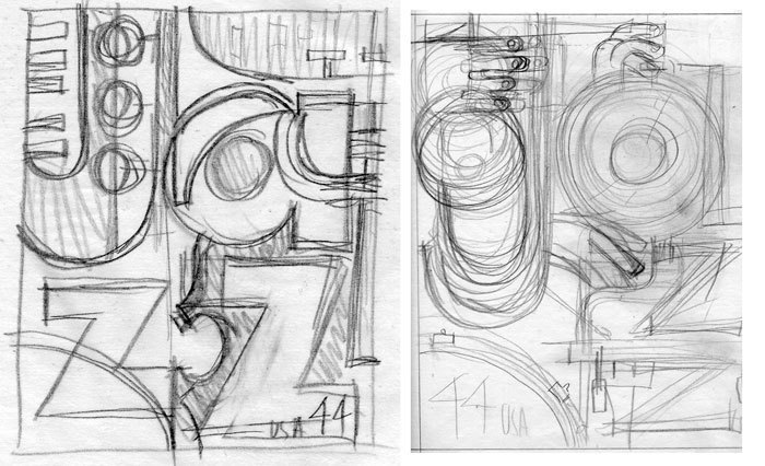
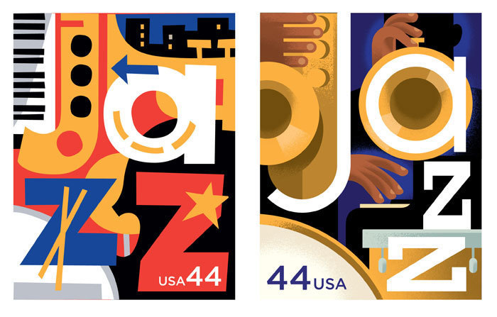
The first sketch carries a lot of Stuart Davis’ influence with a red, white and blue palette and abstracted instrument shapes mixed into the letter-forms. The second design takes a more geometric approach to the letters-and-instruments idea and includes some musician’s hands.
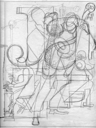
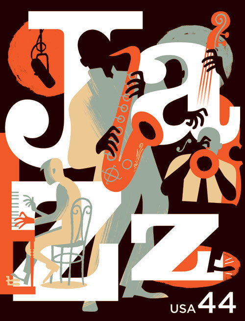
The third design was the one that I felt best about, and it was the one I most wanted to be chosen. It shows a combo hard at work on the bandstand or recording studio. The big challenge was in the interplay between the letter-forms and the drawings of the musicians. A limited palette of orange, black, grey, tan and white carried the feeling of a late-night scene without getting into too much detail.
It turned out that design three was approved very quickly with only a couple of small fine-tuning suggestions and a request to add a female singer into the scene. The singer could have been a problem, it’s not always easy to add another element to something that has been so worked out, but I was able to add her to the top left corner of the design. Also, 2011 is the first year that all stamps will be “Forever” stamps, so the word "Forever" replaces the 44-cent number. From a design standpoint, I’ll miss the graphic element of a numeral in the designs, but it makes economic sense for the customer and the USPS.
The stamp will be issued in March 2011with the official ceremony in the birthplace of jazz, New Orleans.